
Understanding the Box Plot: A Powerful Tool for Data Interpretation
Statistical visualization lies at the heart of data-driven decision making. Among the most useful visualization tools is the box plot—also known as a box-and-whisker plot. Simple in design yet incredibly informative, the box plot allows analysts to quickly assess data distribution, central tendency, and variability.
Whether you’re a student learning statistics, a data analyst evaluating patterns, or a trader optimizing a strategy, the box plot helps turn raw data into insight.
🔎 What Is a Box Plot?
A box plot is a graphical representation that displays:
- The median of a dataset
- The lower and upper quartiles
- The minimum and maximum values
- Outliers, if any
It summarizes a dataset in a compact visual format, making it easy to compare distributions across multiple groups.
A typical box plot consists of:
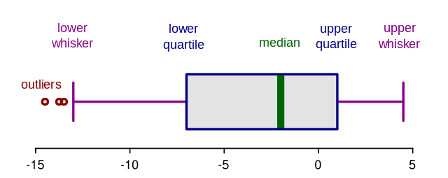
Outliers are usually plotted as individual points beyond the whiskers.
🧮 How Is a Box Plot Computed?
A box plot relies on the five-number summary:
| Component | Meaning |
|---|---|
| Minimum | Lowest non-outlier value |
| Q1 | 25th percentile (lower quartile) |
| Median | 50th percentile |
| Q3 | 75th percentile (upper quartile) |
| Maximum | Highest non-outlier value |
Steps to compute:
- Arrange data from smallest to largest
- Find the median
-
Split the data:
- Lower half → compute Q1
- Upper half → compute Q3
-
Calculate Interquartile Range (IQR):
IQR = Q3 − Q1
-
Determine possible outliers using:
Lower fence = Q1 − 1.5 × IQR
Upper fence = Q3 + 1.5 × IQR
Values beyond these fences are reported as outliers.
📖 How to Interpret a Box Plot
A box plot provides insights into:
✔️ 1. Central Tendency
The median line inside the box shows where most data points cluster.
✔️ 2. Spread of Data (Variability)
A larger box indicates higher volatility or dispersion.
✔️ 3. Symmetry or Skewness
- Median centered in the box → Symmetric distribution
- Median closer to Q1 → Right-skewed (high values or spikes)
- Median near Q3 → Left-skewed (lower values dominate)
✔️ 4. Outliers
Dots outside the whiskers may indicate:
- Errors
- Market anomalies
- Rare events (important in financial risk analysis)
📈 Box Plot in Financial Market Trading
In financial analytics, box plots are extremely useful for:
- Evaluating volatility across assets
- Comparing performance of trading strategies
- Detecting abnormal price behavior
- Identifying risk and stability in returns
🧪 Example: Daily Returns of EURUSD
Suppose you collected 20 days of EURUSD daily returns (%):
-0.05, 0.11, 0.14, 0.10, -0.02, 0.25, -0.08, -0.11, 0.18, 0.06,
0.09, -0.03, 0.04, 0.30, -0.15, -0.01, 0.05, 0.12, -0.07, 0.22
After computing quartiles:
- Q1 = -0.05
- Median = 0.06
- Q3 = 0.14
- IQR = 0.19
Whiskers:
Lower fence = -0.05 − 1.5(0.19) ≈ -0.335
Upper fence = 0.14 + 1.5(0.19) ≈ 0.425
Since all values lie within the fences, there are no extreme outliers, but the data shows:
- Positive skew (more positive returns)
- Moderate spread (box width indicates volatility)
- A relatively stable median of 0.06% per day
🧩 Interpretation for Traders
A trader can conclude:
- The pair is not highly volatile.
- Bias trends slightly upward (positive skew).
-
Risk is moderate, making the pair suitable for:
- Mean-reversion strategies
- Moderate-risk swing trading
- Algorithmic trend systems with systematic risk control
If the box plot had large whiskers or many outliers, it would signal high volatility—ideal for breakout or high-risk high-reward strategies.
🏁 Final Thoughts
A box plot may look simple, but it offers powerful analytical insights. It allows traders, analysts, and researchers to quickly assess:
- Data distribution
- Variability and volatility
- Anomalies and irregular patterns
In financial markets, box plots help traders evaluate risk profiles, compare currency pairs or assets, and assess the performance or stability of algorithmic strategies.
Understanding the Box Plot: A Powerful Tool for Data Interpretation